In part 1 of this series we went through the research phase of writing content.
By now, you should have a good idea about what people are saying about you – preferably with a bunch of quotes you think you could use.
In part 2 we are going to go through how to take that research and turn it into a first pass at a landing page.
Let’s go!
What’s the goal of this page?
The first thing you need to do is come up with the one goal you want this page to achieve.
We’re not designing a catch-all page, we’re designing a landing page which means we want the user to do just one thing.
Usually this means we’re going to provide something valuable to the user in exchange for something else.
For example, your goal could be:
- Sign up to my free course (in exchange for your email address)
- Buy my paid course (in exchange for money)
- Use my free product (in exchange for your email address)
- Buy my small product (in exchange for money)
Once you know what it is you want people to do, you can start writing your copy with this goal in mind.
Outline your landing page
It’s useful to have a rough outline for your landing page before you begin writing so you can be sure to cover all the key points. Take a look at other landing pages to see how they’ve structured theirs and see if there’s any formulas that you think could work for you.
For my landing pages, I usually start with the following outline. Feel free to use it for yours, too. Just remember you can add, remove, or reorder any of these headings if it’s not working for you.
Introduction
Start by introducing your product or the pain that you’re solving. (See below for some examples of both of these).
Illustrate the problem (the pain)
Describe the problem or pain in more detail. Your aim is for your target audience to read this part and think “It’s like they’re speaking directly to me“.
What will the customer get out of this (the dream)
This is where your customer will be when they buy the product (or sign up to your free course). How will their life be better?
Your offer (the fix)
Get into the nitty gritty of what you’re offering them and how it can help get them from the pain to the dream
Who’s behind this (why are you qualified?)
Show that you’re a human being and qualified to help them. Include a picture of you, preferably looking at the camera. Help them trust that you’re a genuine person who can help. Show off your credentials and backstory (if it is relevant).
Call to action (pricing)
This is where they will take action. Show the pricing if it’s a paid product along with some kind of guarantee and testimonial.
Frequently asked questions (overcoming objections)
Overcome any objections people might have with your FAQ. This could include things like your money back guarantee, or re-iterating who this is best suited towards.
Second call to action
Display a second call to action right at the very end. The same as the first.
Include social proof everywhere
Social proof is a way to show potential customers that other people have used this product and had success with it. The most common form of social proof are testimonials. But you can also include case studies, or even banners stating how many active customers you have, or how many 5 star reviews. Include these in as many places as you can, throughout your entire landing page and don’t hide them behind sliders or carousels – they need to be front and centre.
Merging your research with your outline
Using the above as a starting point, draw up a rough outline for how you think your landing page should be structured.
Then take your research and split it into two groups:
- Quotes you can use as testimonials
- Quotes you can reword and use in your copywriting
The first group is pretty straightforward to implement so it’s the second group I want to focus on. What you’re trying to do here is take what existing customers have already been saying about you and repurpose it into actual copy.
There are two main ways to do this:
1. Use your customers words as-is
This is the easiest way to repurpose your customers words. Take a statement that you hear over and over again, re-word it so it sounds catchy, and put it in quotation marks. This isn’t the same as a testimonial because you’re not attributing this quote to one person, you’re attributing it to a sentiment that many people have described.
Some examples:
The Science of Facebook Ads: “What if I spend hundreds of dollars on Facebook Ads and nothing happens?”

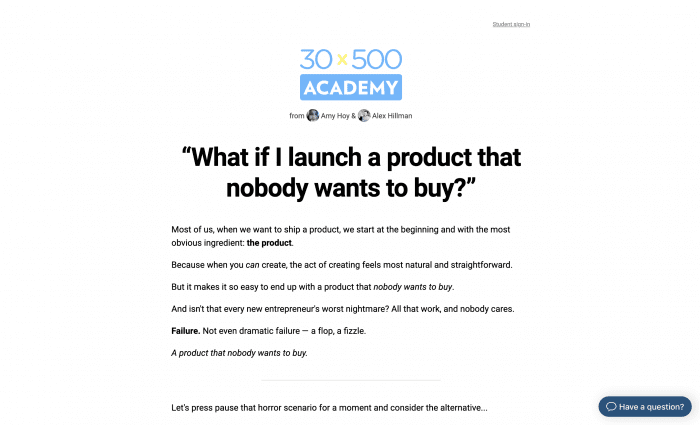
30×500: “What if I launch a product that nobody wants to buy?”
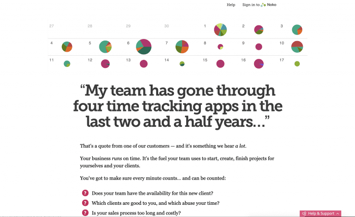
Noko: “My team has gone through four time tracking apps in the last two and a half years…”
These websites are all using a commonly heard statement from customers as their heading. It’s an impactful way to make an impression. If your user has ever had that thought before, they’ll most likely keep on reading.
2. Reword to form a statement
The previous tactic works great for headlines, but what about the rest of your copy? Your entire landing page can’t be written in quotation marks.
This is where you need to get a bit creative. Your job here is to decide on what you want to say, look for customers who have said something similar, and reword that into a statement you can use on your website.
Consider the following (fictional) quote:
“I feel like I’m the the chief content creator but I still need to grow my business at the same time. Since I’m the founder, writing blog posts, newsletters, and lead magnets prevents me from putting my time and energy into the most crucial resources—product development and business growth.”
You could reword that into something like this:
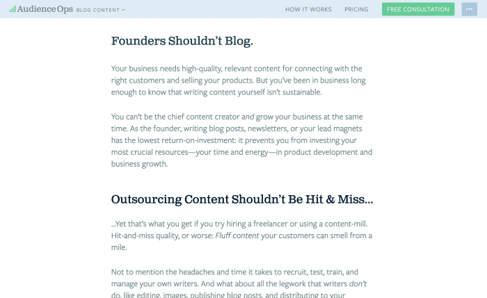
“You can’t be the chief content creator and grow your business at the same time. As the founder, writing blog posts, newsletters, or your lead magnets has the lowest return-on-investment: it prevents you from investing your most crucial resources—your time and energy—in product development and business growth.”
Which is the copy for AudienceOps content creation service:
They have likely written their copy based on listening to what many of their customers frustrations are. It’s difficult to write something so compelling without doing this research first.
Write as if you’re writing a letter to someone
Ultimately you’re better off writing a sales page as if you’re writing a letter to someone. Pick one person in your target audience and pretend you’re writing just to them.
Don’t forget to:
- Empathise with their struggles (A)
- Help them picture a better future (B)
- Show them how to get from A to B
Use your research to inspire the content and try to use your customers words more than your own. In practice, the best way to do this is to go back to your outline, paste under each heading any quotes, thoughts, phrases, or words that are relevant to each. Then you can go back and edit these into your copy.
Remember Joanna Wiebe’s quote from the last article?
“Great copy is the result of curation not creation”. –Joanna Wiebe
That’s exactly what you’re doing when writing landing page copy. You’re not writing from scratch, you’re editing.
Not only will this be far easier for you (especially if you don’t consider yourself a copywriter) but I can almost guarantee it will be more effective for your target customer.
A final word of caution: don’t force it
Before I end this series, I want to give you one final word of caution:
Don’t try to force it if the content isn’t working.
The pain, dream, fix copywriting formula which I described in this article does work. many successful copywriters use it constantly. However, sometimes our audience needs something else.
For example, with my product Client Portal I followed the pain, dream, fix formula and it fell flat on its face. The copy itself was great. It spoke to the real pain people were having but it took too long to get to the thing people really wanted to know: “What is it?”
As soon as I changed the headline from
Never let client projects get out of hand again
Do your clients go dark on you? Do they suddenly disappear, without telling you why? Or even worse, do you hear, a few months down the track, that they’ve switched to one of your competitors?
to
Set yourself apart from your competitors by giving your customers a professional, organised client portal.
Client Portal integrates with WordPress to help you manage your client projects… without the bulky project management software.

People started to understand the product. People started to buy the product. I stopped having to answer emails from (rightfully) confused people about what it is and whether it could help them.
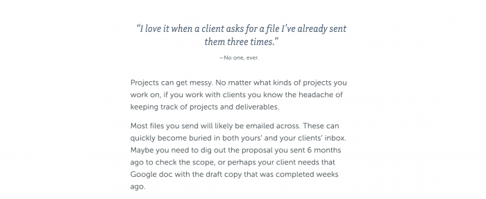
I still kept some of the emotional aspect to the landing page. In fact, the copy directly underneath goes into the pain of not having an organised place to keep client deliverables.
The emotion is still there. It just isn’t as front-and-centre as I use for many other landing pages.
As with anything, your first pass might not be the right one. It might take a few tweaks to get something that resonates with people. You may need to up the emotion, or (like Client Portal) tone it down.
But the advice in this article is what I use as a starting point for every landing page I work on. As with all advice, take it with a pinch of salt. Listen to your customers and keep refining your content. Most importantly, use this advice to get your landing page written and SHIP YOUR PRODUCT 😀.


