Back when I first started designing, I didn’t really care too much about the content.
I would never admit that to anybody because I knew that I’d be crucified. I knew the right thing to say was, “content is way more important than design, design without content is just art” and so on.
Truthfully, all I cared about was making the design look good because that’s what people were hiring me for. They hire a designer because they want a beautiful website that makes their competitors jealous.
And that’s often very true. We do want our websites to look great. We want them to look better than our competitors’ websites. We want people to see our website and say, “WOW! Your website is amazing!”
And frankly, everyone’s first impression of almost anything is how it looks. Deciding whether you find something attractive takes a split second. It takes longer to decide if something reads well, or if something is worth an investment.
To me, my feelings about content vs. design were justified. And my clients backed it up. When I’d ask about content they’d shrug it off saying “use what’s already there” or “we’ll fill in the content later, don’t worry about that”.
Great!
So I’d design something really freakin’ incredible. Not constrained by words and long paragraphs, I’d craft the most perfect website easily. Everything fit, everything aligned, it had the wow factor. And most importantly, I had another great portfolio piece.
But when new clients would come to me wanting to work together, they didn’t care much for the polished pictures of my design overplayed onto an iMac. They wanted to see and interact with real websites I’d created.
They’d ask me for links to these websites which I’d very hesitantly hand over with a disclaimer: “This isn’t what I designed, the client messed it up. Look at these screenshots for a better idea of my actual work”.
Over time, I realised this was a pretty crappy way to do business and it was only when I started working on my own products that I realised it wasn’t the clients messing up the design, it was me designing something that wasn’t realistic, or even usable for their business.
I’d try to design a website for my product, Client Portal, and I’d hit roadblock after roadblock. I’d design and launch something that looked great. But then as time went on, I’d get customer feedback that made me realise I need to change the wording on my website, and the template would break.
I was stuck needing to describe a feature in less than 20 words so it would fit the design. But customers were getting confused by this brevity and needed more information.
I realised my design was restricting me. My design was directly responsible for customer confusion and almost certainly lost sales.
And if that was happening to me, it must also be happening to my clients! So I completely changed the way I did things. Suddenly things like content and customer research were no longer optional – they were mandatory.
I wanted to give all websites I worked on the best chance of success out of the gate, but I also wanted to ensure that future changes wouldn’t break anything.
The design needs to be a help, not a hindrance.
In my design course, Design Fundamentals, the first thing we do is write content for our website. We don’t open any design or coding software, we open a blank Google doc.
The reason we do this is because writing content first — and I mean ALL the content — means you are more likely to design a website that you can actually update.
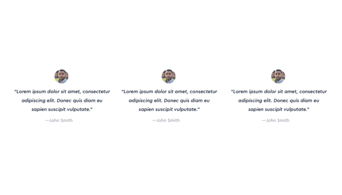
To prove it to you, let’s use the example of a testimonial. Say you want around 3 testimonials on your website. If you weren’t designing content first and you jumped straight into the design, they would probably look something like this:
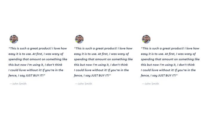
But if you design content first, you’ll find your testimonials and you will probably realise they’re a little longer than you thought. Suddenly centred text doesn’t work so well (you should only use centred text for a maximum of 3 short lines).

If you had designed with real content, maybe your design would look more like this:
This is much better. Now you know the length of your testimonials, you can make better, more informed design choices around them.
But there’s still another problem. You’re assuming all testimonials are going to be similar length to the ones you’ve put in.
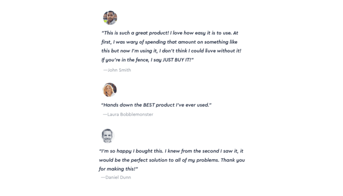
What happens when it’s time to deploy your website and you scramble to find two more testimonials and you realise, uh-oh, now your design looks like this:

It’s not enough to put the majority of content in there. It’s not enough to say “Yeah I’ll find the actual testimonials later”. You need them now. You want the content to be as final as possible before you design.
Then you will have the three real testimonials in a document before you start. You can look at them and you’ll probably see that they all vary widely in length.
So what can you do? Well, you could edit them to make them a similar length. But you’d potentially lose out on some really compelling words. Also, what will you do as the business grows and you get better testimonials?
Editing testimonials doesn’t seem like the right solution. What else could you do?
If they won’t work side by side without creating weird spacing issues, what if you put them one underneath each other? That way, you can add as many testimonials as you like, they can be long, short, or anywhere in between and it won’t matter – they’ll still look great.
Now THAT’S designing. Making visual choices based on logical reasoning.
Websites aren’t pieces of art. (And now I can say that and really mean it). They will change continuously. By writing the content first, you’ll be making informed decisions as to where you need to allow the design maximum flexibility, and where you can afford to be a little more creative. You might not get it right 100% of the time, but you’ll be a lot closer.
So write your content first – all of it – and you’ll notice a difference. You’ll be more confident in your design because you’ll be relying on reasoning instead of subjectivity.


